
Landing Page Work That Moves the Number
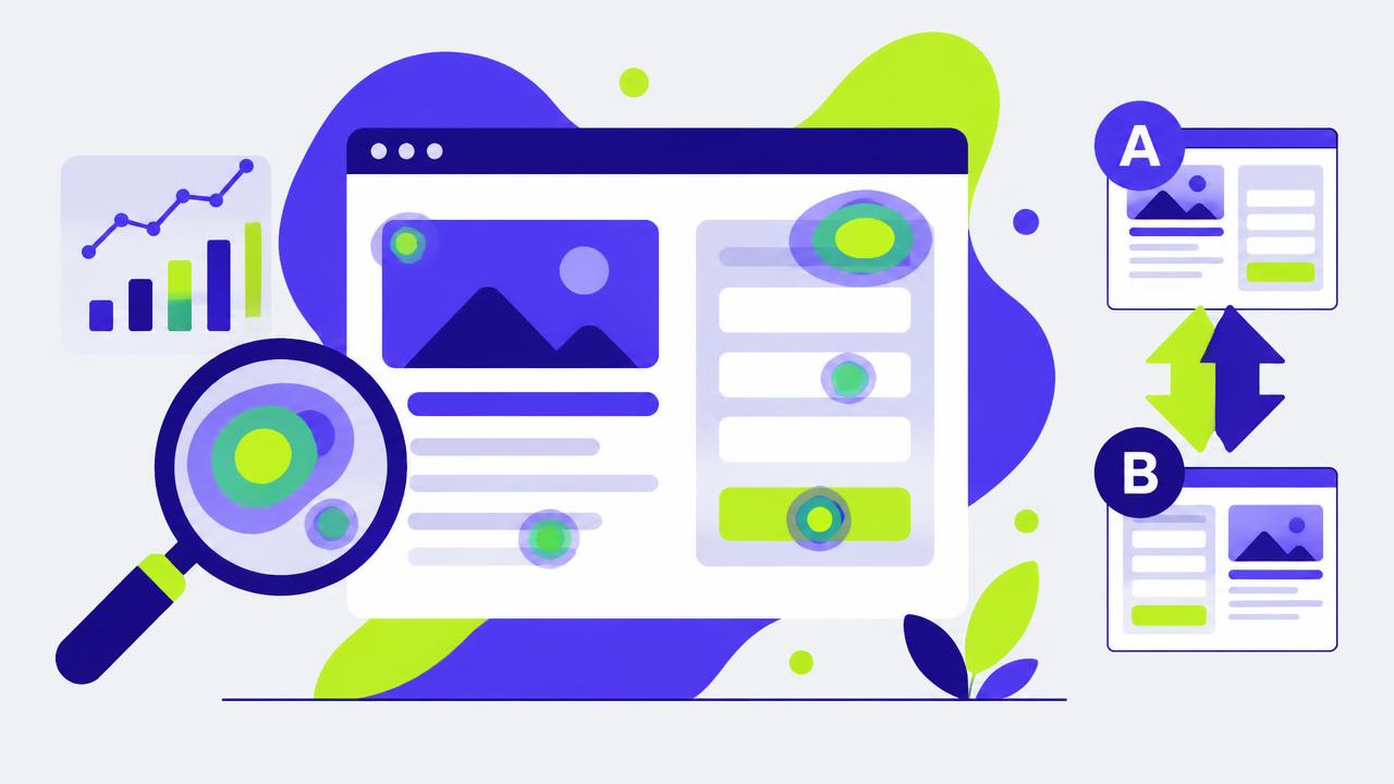
Conversion optimisation acquired a bad reputation by deserving it. A decade of case studies about button colours and arrow directions trained teams to expect large results from trivial changes. Real lifts come from a short list of structural issues, and most pages have at least two of them.
One: message match
The visitor clicked something specific. If the ad promised a price comparison and the page opens with a brand statement, the visitor has to re-orient, and a meaningful share will not bother. The fix is to make the first screen of the page restate the promise of the ad in recognisably similar words.
This is the highest-return change available in most accounts, and it is nearly free — you are not designing anything new, just aligning copy that already exists. For campaigns with several distinct angles, the corollary is that one generic landing page is leaving money on the table; build a variant per angle.
Two: form length
Every field is a decision point. Research across many implementations consistently shows completion falling as fields are added, with the steepest penalties on phone number, company size and anything free-text.
| Field | Keep? | Alternative |
|---|---|---|
| Yes | — | |
| Name | Often | Derive from email later |
| Company | Sometimes | Enrich from email domain |
| Phone | Rarely | Ask after qualification |
| Role / team size | Rarely | Ask in onboarding |
The counter-argument is lead quality: fewer fields means more junk. Sometimes true, and it is testable. Measure qualified leads, not raw submissions, and in most tests the shorter form still wins on qualified volume because enrichment can supply what the form no longer asks.
Ask for the minimum needed to deliver the next step. Everything else can be collected once the relationship exists.
Three: speed
Page speed is not a technical nicety, it is a conversion input with a measurable elasticity. Mobile visitors on variable connections abandon during load, and they never appear in your funnel as a rejection — they appear as traffic that was never really there.
Where the time goes: on most marketing pages the culprits are uncompressed hero images, third-party tags loaded synchronously, and web fonts blocking render. Fixing those three typically halves load time and needs no redesign.
Four: proof placement
Testimonials collected into a carousel halfway down the page are decoration. Proof works when it sits immediately beside the claim it supports: the security statement next to the data question, the specific customer result next to the performance promise, the trust badge next to the payment step.
Specific beats glowing. "Cut our reporting time from two days to twenty minutes" outperforms "Amazing product, great team" by a wide margin, because the first one is falsifiable and the second could be about anything.
Five: the single action
Count the actionable elements on the page: navigation links, footer links, chat widget, secondary offers, social icons. Each one is an exit. High-performing paid landing pages usually strip navigation entirely and offer exactly one action repeated at intervals down the page.
This conflicts with the instinct to be helpful, and it should be tested rather than assumed — for high-consideration purchases some exploration helps. But start from one action and add back only what earns its place.
Running the tests
Structural changes need proper sample sizes. Calculate the required sample before launching from your baseline rate and the smallest lift worth acting on; for most mid-traffic pages that means two to four weeks per test and no peeking. Teams that check daily and stop at the first significant-looking moment generate a stream of lifts that never appear in the revenue line — which is how conversion optimisation earned its reputation in the first place.
Related articles
Growth Loops vs Funnels: Why Your Acquisition Math Keeps Breaking
Funnel thinking treats every customer as a terminal event. Loop thinking asks what each customer produces. The difference shows up in your CAC curve about nine months in.
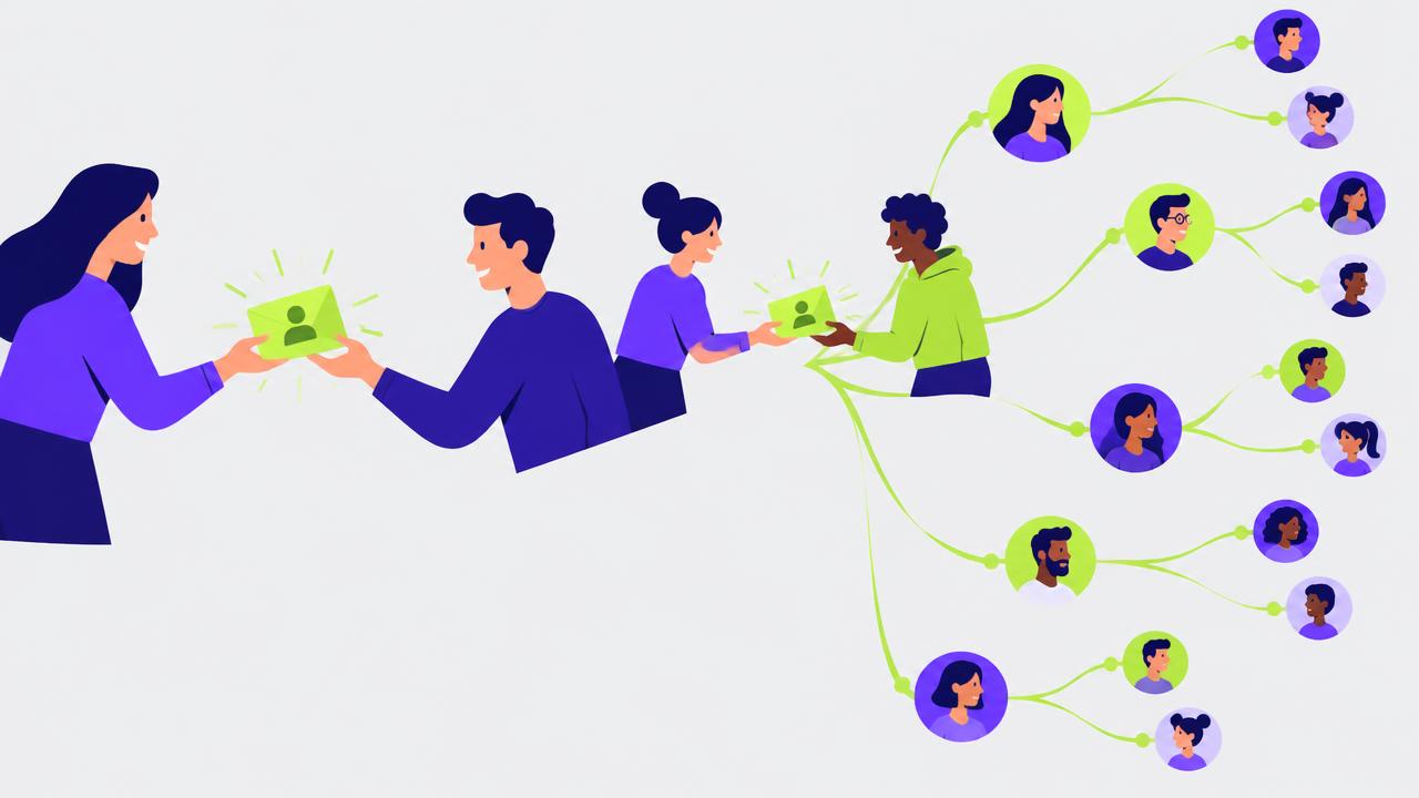
Referral Programs That Work, and the Four Reasons Most Do Not
A referral program is not an incentive, it is a moment. Get the moment wrong and no reward size will save it.
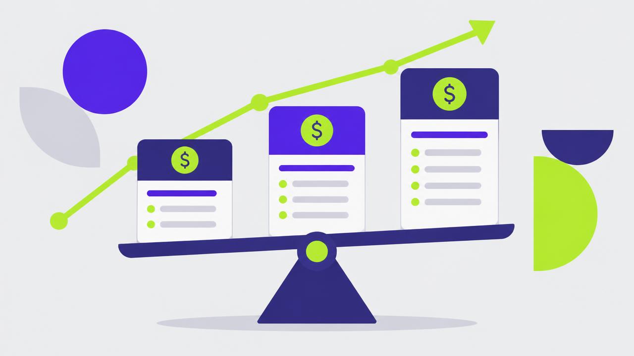
How to Run Pricing Experiments Without Breaking Trust
A ten percent price increase absorbed without churn is worth more than most acquisition campaigns. The question is how to find out safely.