
Reading Retention Curves Without Fooling Yourself
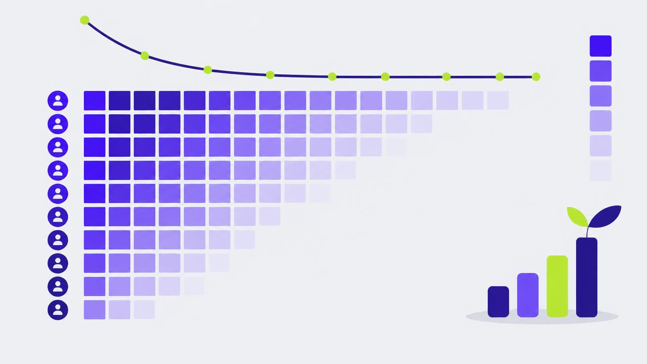
Retention is the closest thing marketing has to a load-bearing metric. Acquisition cost, payback period, loop strength and forecast accuracy all sit on top of it. It is also the metric most often computed in a way that flatters the business.
Build the curve correctly
Group users by the period they joined. For each cohort, plot the share still performing the retention action in period 1, 2, 3 and so on since joining. Age on the x-axis, never calendar time — comparing a January cohort at month eight with a July cohort at month two tells you nothing except that time exists.
Choose the retention action carefully. Login is the laziest available definition and it overstates health everywhere: people open apps by habit and reflex. Use the action that delivers the product''s value — a message sent, a report generated, an order placed, a workout logged. If revenue is recurring, subscription status is a valid second curve, but track the usage curve too, because usage decay precedes cancellation by weeks or months.
What the shapes mean
| Shape | Interpretation | Priority |
|---|---|---|
| Steep drop, then flat plateau | Real product-market fit for a subset | Widen the subset |
| Gradual decline to zero | Novelty, no habit formed | Find or build the recurring need |
| Smile (declines then rises) | Expansion within retained users | Usually a segmentation artifact — verify |
| Flat from period one | Retention action defined too loosely | Redefine the action |
The plateau is the number that matters. A curve settling at 40% means four in ten users become long-term, and the business compounds. A curve heading to zero means every month starts from scratch, and growth is a treadmill powered by the marketing budget.
The height of the plateau sets the ceiling on the business. Acquisition only decides how fast you reach it.
Early and late churn are different problems
Split the curve mentally at the point where it starts to flatten, typically somewhere between period two and period four.
Before the bend, losses are onboarding and expectation failures: the user never reached value, the product was not what the ad implied, setup was too hard. Fixes live in activation, onboarding and acquisition targeting.
After the bend, losses are life-change and competitive: the need went away, the team reorganised, someone else showed up. Fixes live in expansion, habit reinforcement and switching costs. Applying onboarding fixes to late churn is the most common wasted quarter in growth work.
Segment before you act. A blended curve averaging a 60% plateau segment with a 5% segment produces a 30% line that describes nobody. Cut by acquisition channel, plan, use case and company size. The most useful discovery in most retention analyses is that one channel produces customers who never retain.
Common distortions
- Survivorship in recent cohorts: a cohort only two months old cannot tell you about month six. Do not average incomplete cohorts into the headline number.
- Reactivation counted as retention: decide explicitly whether a user returning in period seven after five inactive periods is retained. Either choice is defensible; mixing them silently is not.
- Selection by paid campaigns: a campaign targeting existing brand searchers produces flattering cohorts. Cut by channel or the whole picture is distorted.
Turning the curve into a decision
Two practical outputs justify the analysis. First, the area under the curve times average revenue per period gives lifetime value, which sets the acquisition budget ceiling. Second, the gap between your best segment plateau and your blended plateau is the size of the retention prize, and it is almost always larger than the gain available from any acquisition optimisation.
Rebuild the curves monthly, keep the definition fixed, and resist the urge to change the retention action when the number is disappointing. A worse honest number beats a better convenient one, because everything downstream is computed from it.
Related articles

Growth Loops vs Funnels: Why Your Acquisition Math Keeps Breaking
Funnel thinking treats every customer as a terminal event. Loop thinking asks what each customer produces. The difference shows up in your CAC curve about nine months in.

Referral Programs That Work, and the Four Reasons Most Do Not
A referral program is not an incentive, it is a moment. Get the moment wrong and no reward size will save it.

How to Run Pricing Experiments Without Breaking Trust
A ten percent price increase absorbed without churn is worth more than most acquisition campaigns. The question is how to find out safely.